
| Role | Web Design (UX/UI) / UX Research + Low and High Fiedility Prototype |
| Domain | Education |
| Tool used | Figma, Miro |
| Case Study duration | 72 Hours |
For completing the whole whiteboard challenge I have divided the complete design process into four sections.
| Empathy | Ideation |
| Define | Wireframe |
Problem Statement
Intellipaat is really good and highly recommended e-learning platform for learning new technology and to enhance technical skills like cloud computing which is very much in demand in market now. However, there are other similar e-learning platforms lime Udemy, Coursera, Simplilearn, CodeAcademy etc. and many free youtube videos which are offering similar courses on clound computing.
01/Empathy – Understand users
Discovery
🎯 Understand goal (why)
Intellipaat aims to optimize its landing page for selling cloud computing courses so that it can convert visitors into paying customers and increase marketshare.
🔔 Why this feature is important ?
Designing sales landing page is one of the toughest challenge since we’re directly asking for the visitors’ money. It should addresses buyers’ objections as exhaustively as possible so that visitors gets converted into permanent and repeated customers and contribute to profit and market share increase.
🎯 Analyse the existing webpage
An existing design can serve as a useful starting point for a new design, hence I decided to scan https://intellipaat.com/course-cat/cloud-computing-courses/ for existing usability issues, design inconsistencies etc.
🚨Existing usability issues
For heuristic evaluation I predominantly followed 10 Usability Heuristics for User Interface Design by Jakob Nielsen. Apart from this 10 guideline few other well known design principles to find out usability issues. I also collected feedback thread from different social forums
| Guidelines | Issues | Recommendations |
| always keep users informed aboutwhat is going on, through appropriate feedback | Where website dynamically loads content, then users need a clear sign that the website is doing this. | Keep user informed through progress indicator |
| Familiar words and phrases | ||
| User control and freedom | ||
| Consistency | Course details icons are not self explanatory, | icon with label |
| Recognition | Need minimalistic design – third level menu adding too much content , Can include mega menu. | Include all options in first level which is already a sticky menu |
| Aesthetic and Minimalist Design | without minimalistic design users lose focus and it affects conversion. Also scrolling area of certification is redundant as we can easily incorporate the same in the course tile | Designers must avoid placing distracting links like navigation or footer links on their landing pages. Fewer choices minimize confusion and simplify the conversion process. Remove scrolling area of certifications |
Apart from ten usability heuristics, I have listed down few usability guidelines for sales landing page which can help business in attaining engagement and conversion optimization. Below are the list
| Landing page usability guidelines | Issues | Recommendations |
| Identifying key actions visitor want to take | no prominent key actions highlighted | Identify what we want to achieve through this page and highlight key actions |
| Persuasive copywriting | Content is good but not persuasive enough for conversion | Improve content and headline so that users are tempted to take the course |
| Provide offer to address pain points | No offer section | Use FOMO to sale the course |
| Impactful visuals | No | Can embed video or actual image |
| Prominent call to action | No | Key actions to be presented as call to action |
| Clear Messaging | No | |
| Findability | There are too many contents with multiple sections. | Fewer choices minimize confusion and simplify the conversion process. |
| Write enticing copy | target audience never reads beyond the headline. Headline is very general | Headline should be catchy |
| Key action above the fold | Key actions like checking popular courses are below the fold | Need to remove redundant part of top portion |
| Show your product/service in action | Static image is present | Can embed live video or image |
👥 Who are the main target users?
✅ Students and Job Seekers searching for job oriented course – age: 18 + years
✅Teachers or Instructors – for Delivering courses
✅ Sale and Marketing Team – for getting max conversion, campaign success and reaching target.
👥 Opportunity audience
✅ Unsatisfied Jobseekers who have already taken course elsewhere
✅ Users who got laid off
✅ Housewives who are in career break
🎯 What are business objectives?
✅ To increase revenue and market share in e-learning domain and be a prominent name in delivering job effective course in Cloud Computing.
🚩Who are facing the problem ?
✅ Jobseekers specially who are looking for career oriented course in Cloud Computing are not getting converted to actual customers even after landing in the page or forwarding enquiry
✅ Sale and Marketing Team – Not getting enough leads and actual conversion even after when actual analytics is showing people in landing and searching for course
What are some expected solutions ?
An optimized landing sale page for cloud computing which helps in maximizing revenue, potential lead conversion with a smooth and happy user experience for job seekers.
User Research
🗪 User Interview – Key findings & insights
I carried out four interviews on Zoom and one in person. Six participants were from current users who are taking courses from Intellipat, Teachers and Sale/Marketing and tried to get following answers around following context
👉 How did you buy the course using other products ?
👉 What outcome are you expecting to achieve post optimization of page?
✅ User Interview Findings
- Jobseekers are more interested in actual figures related to job people get post course , which are hiring companies
- Users has issue for long page and better to have only must to have sections
- Due to long scrolling page better to view navigation while scrolling
- User not able to find the key action from the interface of the page
- For dynamically loading page better to have loader
✅ Findings from Adobe Analytics
By studying the dashboard of Adobe, got more information on data like bounce rate, time-on-page, page speed, and more. This help to track landing page conversions and measure campaign success.
We have also analyzed form analytics which helps to identify the areas where users face friction on the page. Thus it is a surefire way to increase conversion rates and reduce abandonment rates.
✅ HeatMap
to identify opportunities to improve page layouts and content placement we have analysed heatmap.
02 / Define – User’s Needs and Problems
Problem Statements
03 / Define – User’s Needs and Problems
04 / Prototype – Wireframe and Prototype & Iterations
Moodboard
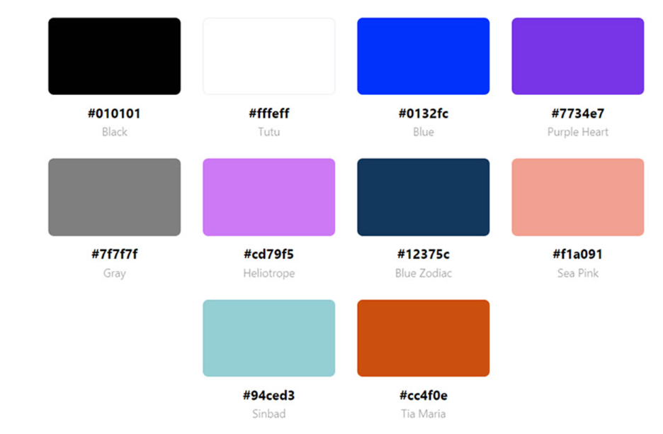
Color schemes
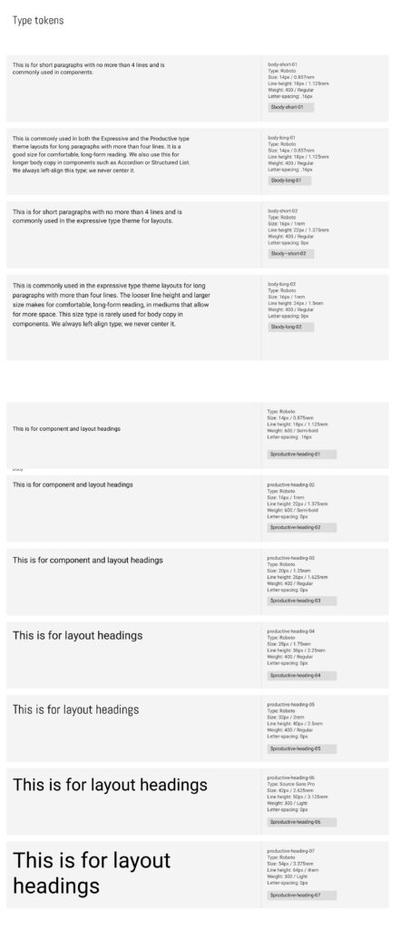
Type Tokens
💡Design Principle and rationale behind revised designs
✅ An appealing title that highlights the course benefits can boost registrations.
✅ Using a live video or similar feature instead of a random static image can boost user confidence in the service or product.
✅ Important actions are displayed above the fold on the page
✅ Prominent call to action button for course grid
✅ This course is aimed at job seekers who want to know the benefits others have gained after completing it. Including details like hiring companies, job titles they can pursue, and the programming languages they will learn would enhance its value.
✅ Users can switch to their preferred course type, such as popular courses or key certifications, using a tab structure. A filter could also be equally effective instead of tabs, giving user a ability to control view.
✅ FOMO has been created by offer
💡Accessibility guidelines
❶ Typography
- line-height is 1.5 times the font size. Spacing following paragraphs is 2 times the font size. Letter spacing is 0.32px (suggested is at least 0.12 times the font size). No font is less than 10px
- Source :Text Spacing (Level AA)
❷ Color Contrast
- Checked color contrast by https://webaim.org/resources/contrastchecker/
- For purple as foreground and white as background contrast ratio is 7:32:1
- For orange action button in course the test passed for Graphical Objects and User Interface Components
❸ Descriptive and informative page title.
❹ Meaningful links – Links label are not descriptive rather relevant to desired action like View Course
Leave a Reply