Enterprise Dashboard Migration
Migrating enterprise analytics from Tableau to Power BI
Redesigning and standardizing 10+ enterprise dashboards while building a scalable Power BI visual system powered by a custom JSON theme.
Role
Product Designer
Led dashboard UX modernization and migration experience.
Scope
10+ Dashboards
Executive, operational, and analytics reporting dashboards.
Platform
Tableau → Power BI
Migrated dashboards while preserving business continuity.
Deliverable
JSON Theme System
Built reusable visual standards for scalable dashboard design.
Dashboard Transformation
The Problem
The dashboards worked. The experience didn’t.
As Solstice transitioned from Tableau to Power BI, the challenge was not just migrating reports — it was redesigning analytics experiences into a scalable, modern, and visually consistent system.
Migration Challenge
We kept things familiar, but gave the reporting experience a fresh, modern feel.
Existing dashboards had inconsistent layouts,chart styles, and navigation patterns.
Teams relied heavily on visual familiarity, making drastic redesigns risky.
Power BI introduced platform constraints that required redesigning interaction behavior.
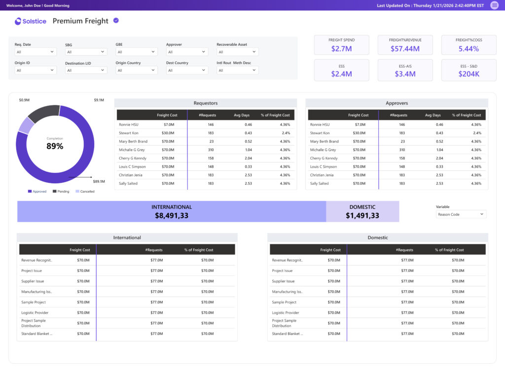
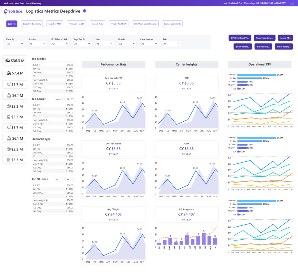
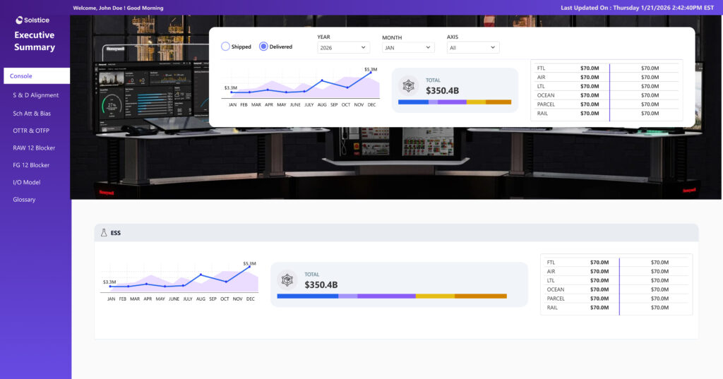
Dashboards
Multiple dashboards needed migration while preserving reporting continuity.
Unified Theme
A custom JSON theme standardized colors, typography, spacing, and chart behaviors.
Scalability
The new system needed reusable design patterns for future dashboard expansion.
Visual Clarity
Dense enterprise data needed stronger hierarchy and faster scanability.
The Solution
Not just a platform migration.A complete analytics UX upgrade.
The solution focused on modernizing enterprise reporting through standardized UX patterns, reusable visual systems, and cleaner dashboard experiences in Power BI.
Core Transformation
Building a scalable reporting ecosystem across all dashboards.
Tableau → Power BI Migration
Migrated enterprise dashboards while maintaining reporting continuity.
UX Modernization
Redesigned dashboard hierarchy, layouts, and interactions for faster scanning.
JSON Theme System
Created reusable design standards for charts, typography, spacing, and colors.
Consistency
Unified Visual Language
Standardized charts, layouts, typography, spacing, and KPI behavior across all dashboards.
Usability
Cleaner Information Hierarchy
Improved dashboard readability through clearer grouping, spacing, prioritization, and scan patterns.
Scalability
Reusable Dashboard System
Established scalable design patterns for future dashboards and reporting modules.
Enterprise UX
Faster Data Consumption
Reduced visual clutter and improved decision-making through structured dashboard experiences.
Design Strategy
Building a dashboard system, not just a set of separate screens.
The goal here was simple — create reusable and scalable UX patterns so everything feels consistent, easier to read, and works smoothly across the enterprise.
UX Principles
We simplified the dashboards so everything feels familiar, clean, and easy to use.
Standardized Dashboard Structure
We aligned grids, spacing, typography, and components so every dashboard follows the same structure.
Clear Information Hierarchy
We organized content from KPIs to trends to detailed insights, making it much quicker to scan and understand.
Consistent Interaction Patterns
Filters, slicers, drilldowns, and navigation all behave the same way across dashboards, so users don't have to relearn things.
Layout System
Reusable Grid
We created repeatable layout patterns so every dashboard feels consistent and visually balanced.
Visual Hierarchy
Faster Data Scanning
By prioritizing key metrics and using spacing wisely, users can quickly find what matters.
Interactions
Predictable User Flows
Keeping slicers and interactions in familiar places helped reduce confusion and made usage smoother.
Design System
JSON Theme Standardization
We built a shared visual system covering typography, colors, spacing, and branding to keep everything aligned.
Dashboard Design System
A reusable visual system for scalable enterprise dashboards.
Instead of redesigning dashboards individually, a centralized Power BI design system was created to standardize typography, layouts, spacing, colors, and chart behaviors.
Core System
Custom JSON Theme
Typography
Segoe UI
Grid System
8pt Spacing
Chart Palette
Components
Reusable Cards
Interaction Pattern
Filters ? Slicers
Visual Consistency
Unified colors, typography, and spacing created a cohesive enterprise reporting experience.
Smarter Data Hierarchy
KPI-first layouts improved scanning speed and reduced cognitive overload.
Predictable Interactions
Standardized slicers and filters reduced learning friction across dashboards.
Scalable Layout Framework
Reusable dashboard structures accelerated future dashboard creation and consistency.
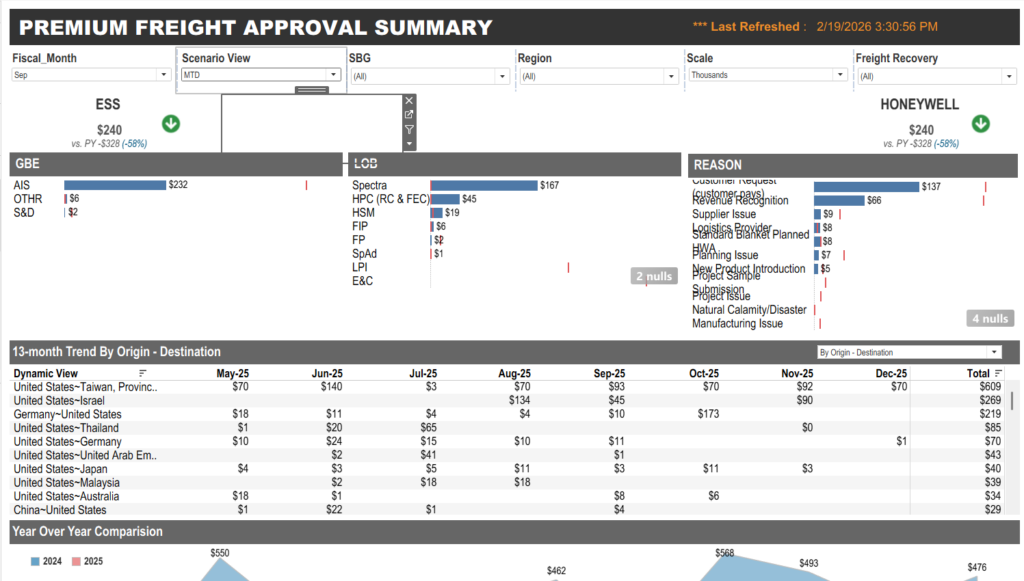
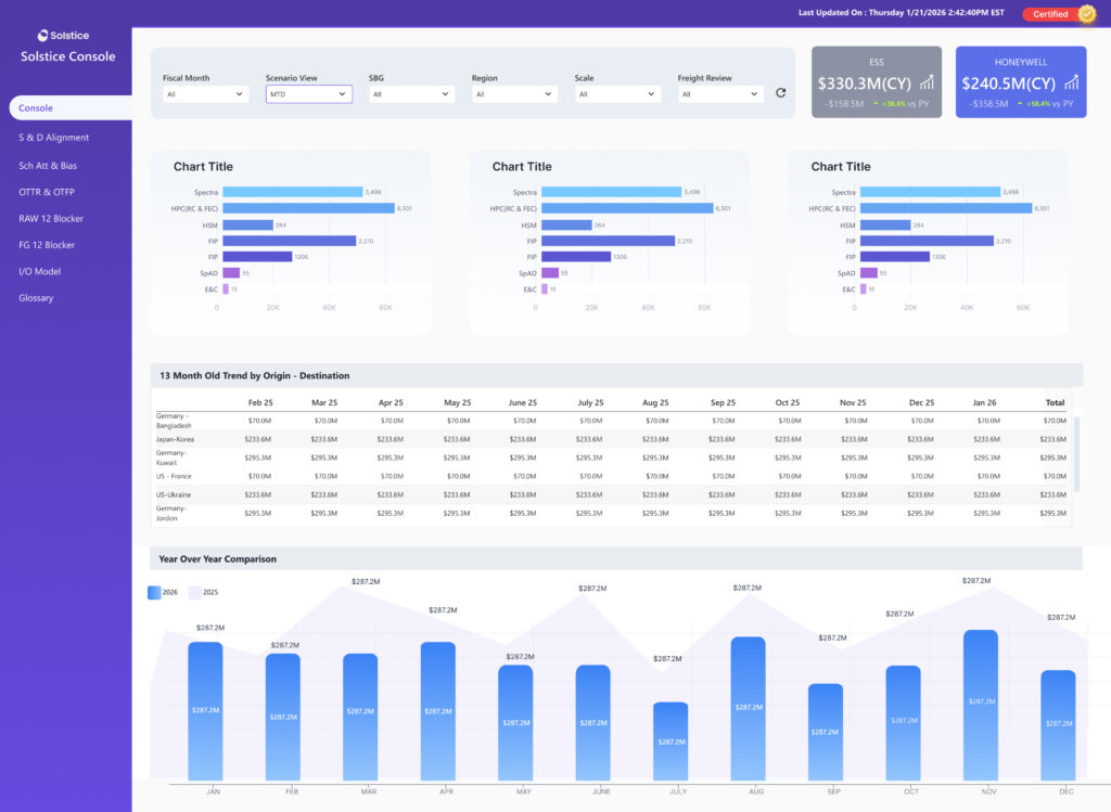
Tableau vs Power BI comparison
Before & After
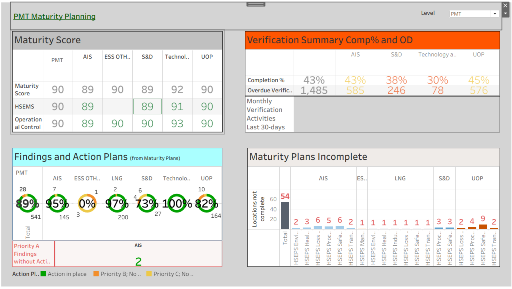
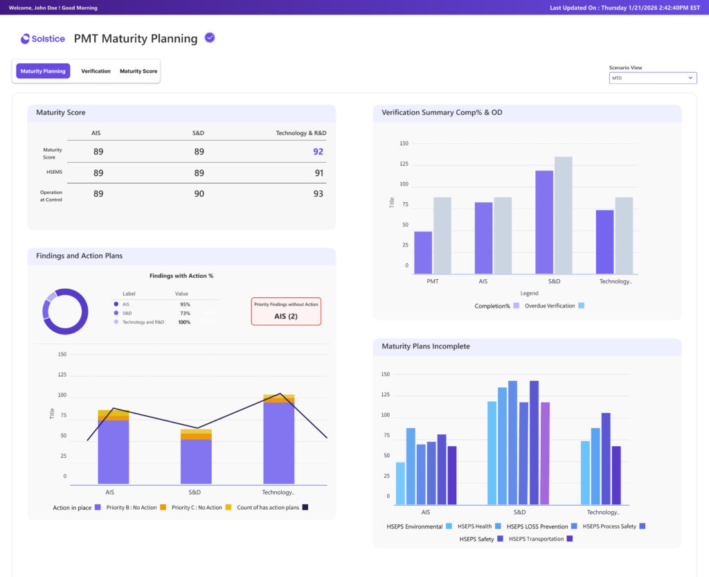
Dashboard Gallery
Tableau to Power BI Migration
Tableau
Power BI
Power BI
Tableau
Strategic Impact & Effort Matrix
Impact Matrix: Prioritizing What Matters Most
Overall Outcome
Clear product direction and prioritized roadmap, Faster alignment across stakeholders
Quick Wins (High Impact · Low Effort)
Improving data readability , Cleaning clutter and chart clarity
Major Enhancements (High Impact · High Effort)
Redesigning dashboard,Enabling smarter filtering,advanced analytics views
Fill-ins (Low Impact · Low Effort)
Minor UI refinements, Visual consistency improvements
Deprioritized (Low Impact · High Effort)
Complex visual customizations with limited value
Leave a Reply